Create Custom Input Types
In this document we will create a custom input type step by step. Our input type is multi-select combobox input type.
Go to
*.Coreand create a folder namedCustomInputTypes.Create a class named
MultiSelectComboboxInputTypein that folder./// <summary> /// Multi Select Combobox value UI type. /// </summary> [Serializable] [InputType("MULTISELECTCOMBOBOX")] public class MultiSelectComboboxInputType : InputTypeBase { }Go to
AppDynamicEntityParameterDefinitionProviderand add new input type.public class AppDynamicEntityParameterDefinitionProvider : DynamicEntityParameterDefinitionProvider { public override void SetDynamicEntityParameters(IDynamicEntityParameterDefinitionContext context) { ... context.Manager.AddAllowedInputType<MultiSelectComboboxInputType>(); ... } }Go to
angular\src\app\shared\common\input-typesfolderCreate new component named
MultiSelectComboboxInputTypeComponentas seen below.ng g component multi-select-combobox-input-typemulti-select-combobox-input-type.component.html
import { Component, OnInit, Injector } from '@angular/core';
import { InputTypeComponentBase } from '../input-type-component-base';

@Component({
  templateUrl: './multi-select-combobox-input-type.component.html'
})
export class MultiSelectComboboxInputTypeComponent extends InputTypeComponentBase implements OnInit {
  filteredValues: string[];

  constructor(
    injector: Injector,
  ) {
    super(injector);
  }

  ngOnInit() {
    this.filteredValues = this.allValues;
  }

  getSelectedValues(): string[] {
    debugger;
    if (!this.selectedValues) {
      return [];
    }
    return this.selectedValues;
  }

  filter(event) {
    this.filteredValues = this.allValues
      .filter(item =>
        item.toLowerCase().includes(event.query.toLowerCase())
      );
  }
}
multi-select-combobox-input-type.component.html
<p-autoComplete [(ngModel)]="selectedValues" [suggestions]="filteredValues" (completeMethod)="filter($event)" [minLength]="1" [multiple]="true" inputStyleClass="form-control" styleClass="w-100">
</p-autoComplete>
You must extend
InputTypeComponentBase. Since you extendInputTypeComponentBaseyour component will have selectedValues(initial stored selected values), allValues(all values that your component can have, if your component needs initial values.)Then go to
angular\src\app\shared\common\input-types\input-type-configuration.service.tsand add your input type.export class InputTypeConfigurationService { ... private initialize(): void { ... let multiselectComboBoxInputType = new InputTypeConfigurationDefinition( 'MULTISELECTCOMBOBOX', MultiSelectComboboxInputTypeComponent, true//is that input type need values to work. For example dropdown need initial values to select. ); this.InputTypeConfigurationDefinitions.push(multiselectComboBoxInputType); } ... }Go to
angular\src\app\shared\common\app-common.module.tsand add your component to entryComponents:@NgModule({ ... declarations: [ ... MultipleSelectComboboxInputTypeComponent ], ..., entryComponents: [ ... MultipleSelectComboboxInputTypeComponent ] })
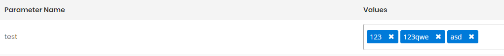
All done. Your custom input type is ready to use in dynamic parameter. Create new dynamic parameter which uses that input type, add it to an entity. Then you can go to manage page and use it.